# Products list carousel
{% hint style="success" %}
Steps
1. In the theme editor (**Customize**), click **Add section**
2. Locate **Products list carousel**
3. **Save**
{% endhint %}
## Section settings
### **Section header and general**
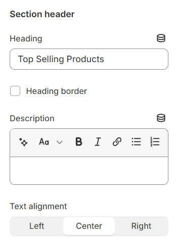
Use the provided text fields to add a suitable heading/subheading/description. Leave any of them blank if you do not want to display them.
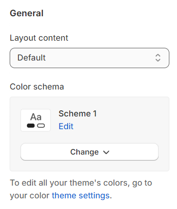
**Layout:** You can choose among Default, Fluid container and Full width for the banner layout.
**Color schema:** You are allowed to change text color, background color with preset color.
### **Product settings**
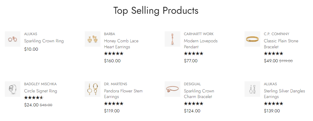
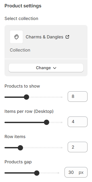
**Select Collection:** Choose a collection to display its products.
**Products to show:** Set how many products to display, with a range between 1 and 20.
**Items Per Row:** Choose how many products appear per row, selecting from 1 to 5.
**Row Items:** Determine the number of items within each row, with options from 1 to 5.
**Products Gap:** Adjust the space between columns to achieve the desired layout spacing.
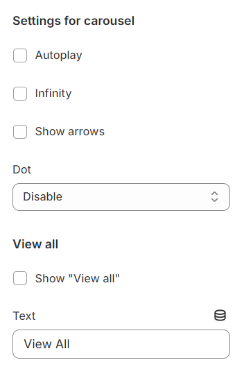
### **Carousel settings**
**Autoplay / Infinite Play:** Enable this setting for the carousel to automatically scroll through items indefinitely, providing a seamless browsing experience.
**Show Arrows** and **Dots:** Activate arrows for users to manually swipe through carousel items and dots for a visual indicator of their position within the carousel.
Direct Navigation via **Dot:** Utilize dots to allow users to jump directly to a specific tab or item in the carousel, enhancing navigation efficiency.
You can use the **View all** setting to display text on the right side of the default heading section. You can change the text and the path will automatically default to the selected collection.
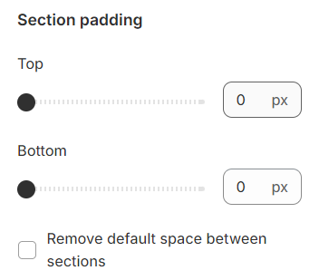
### **Section padding**
Section padding allows you to specify the space between this section and the preceding or following sections, or both.