# Sidebar & Filter
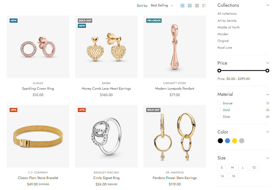
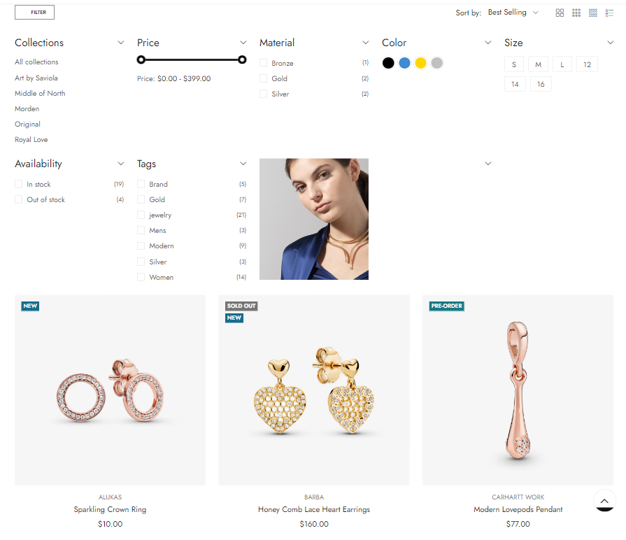
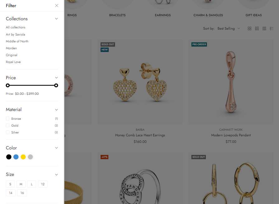
After **Sidebar & Filter** is enabled, the **Sidebar Collection** option has a total of 5 **blocks** for you to add to the sidebar:
* Categories
* Filter Dynamic
* Filter by tags
* Featured Products
* Image Banner
You also have the ability to arrange the position of blocks through **drag and drop.**
When you click on each block, it will show the **settings sidebar** (of each block).
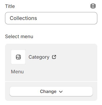
### Category
**Title:** Define the heading or title for the section to clearly convey its purpose or content to viewers.
**Select Menu:** Choose a specific menu from your available options to display, guiding users through your site's navigation or categories.
### Filters dynamic
This feature allows you to filter products by price. For instructions on how to set this up, please follow [this link](https://blueskytechco.gitbook.io/alukas-shopify/collection-page/filter-dynamic).
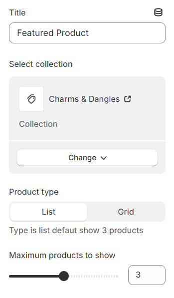
### Featured product
**Title:** Assign a name or heading to this section for clarity and emphasis.
**Select Collection:** Choose which collection you wish to feature from your available options.
**Product Type:** Specify the type of products you're aiming to display within this section.
**Maximum Product to Show:** Set a limit on the number of products to be displayed, managing the section's size and user experience.
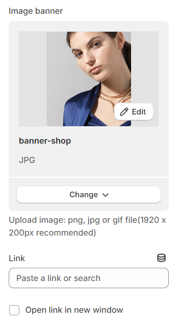
### Image banner
**Image Banner:** Choose an image to serve as the banner for this section.
**Link:** Provide a URL that users will be directed to when they click on the image banner.
### Banner collection
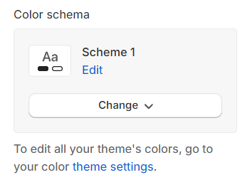
**Color schema:** You are allowed to change text color, background color, etc. with preset color.
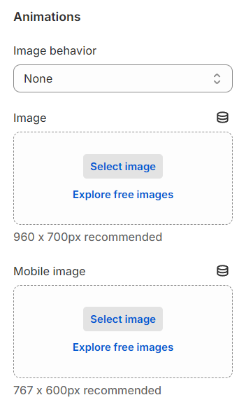
**Image Behavior:** Select an animation to enhance the image with dynamic effects.
**Image:** Configure the image to display differently on desktop and mobile devices for optimized viewing across various screen sizes.
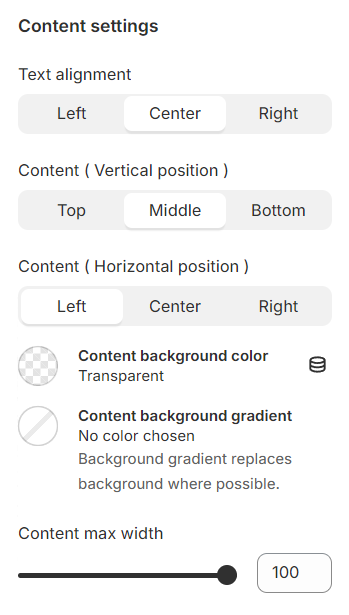
**Content Settings:** Adjust the alignment and position of your content both horizontally and vertically to achieve the desired layout.
**Background:** Set the background color to complement or contrast with your content for visual appeal.
**Content Max-Width:** Define the maximum width of your content area to ensure it fits well within the overall design and maintains readability.
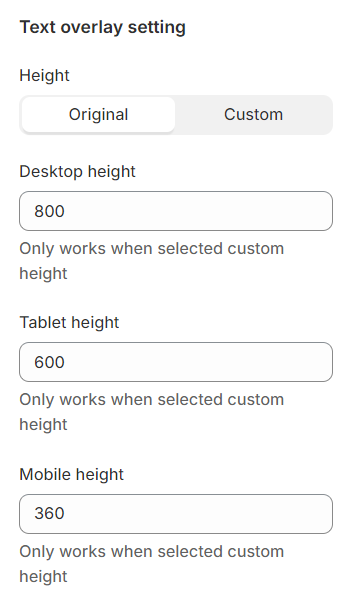
For the text overlay setup, configure the height of the text content separately for desktop, tablet, and mobile devices, ensuring optimal readability and layout adaptation across various screen sizes.
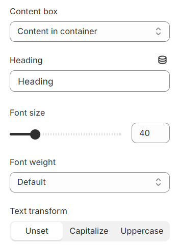
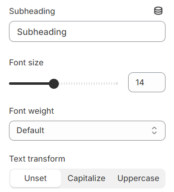
You can configure the font size and weight for headings, subheadings, and buttons, allowing you to tailor the text appearance for clarity and visual impact across your content
**Sidebar position on desktop:** you can choose one of the config
{% tabs %}
{% tab title="Left sidebar" %}
{% endtab %}
{% tab title="Right sidebar" %}
{% endtab %}
{% tab title="Dropdown sidebar" %}
{% endtab %}
{% tab title="Canvas sidebar" %}
{% endtab %}
{% endtabs %}