

Products carousel

Steps
In the theme editor (Customize), click Add section
Locate Products carousel
Save
Section settings
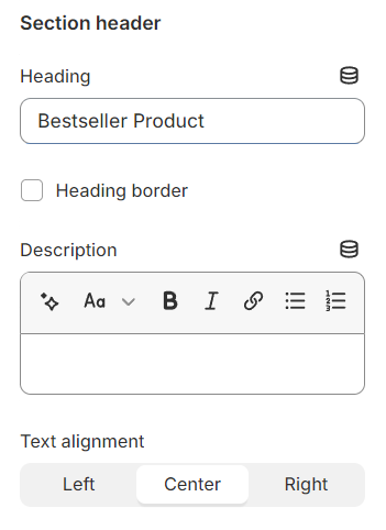
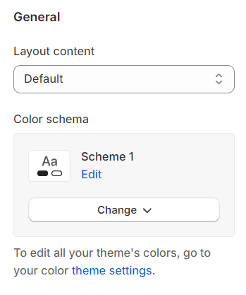
Section header and general:
Use the provided text fields to add a suitable heading/subheading/description. Leave any of them blank if you do not want to display them.
Adjust the text alignment (left/center/right) along with the background color and container type.
Layout: You can choose between Fluid Container, Stretch width, Full width for the layout or just leave it with the default layout of the video.
Color schema: You are allowed to change text color, background color, etc. with preset color.
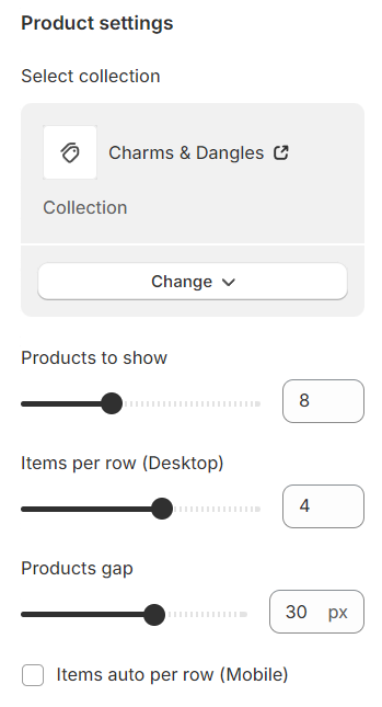
Products settings
Specify the quantity of products to display, the number of products per row, and the gap between two adjacent products.
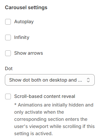
Carousel settings
Autoplay / Infinite Play: Enable this setting for the carousel to automatically scroll through items indefinitely, providing a seamless browsing experience.
Show arrows and Dots: Activate arrows for users to manually swipe through carousel items and dots for a visual indicator of their position within the carousel.
Direct avigation via Dot: Utilize dots to allow users to jump directly to a specific tab or item in the carousel, enhancing navigation efficiency.
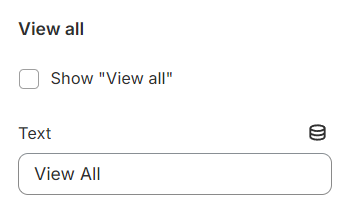
Include a View aall option that allows users to navigate to a dedicated page showcasing all available products.
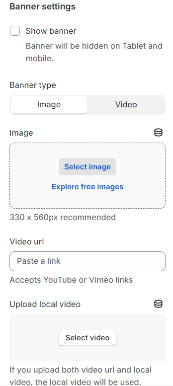
Banner settings
Show banner ooption: Activating this will display the banner on desktop devices while ensuring it remains hidden on tablets and mobile for a tailored viewing experience.
Type: Specifies the type of media, such as an image or video, used for the banner, allowing for precise content selection.
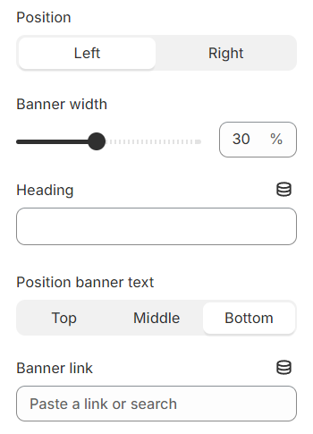
Position: Determine the banner's placement, opting for either the left or right side of the carousel for strategic visibility.
Banner width: Define the width of the banner to ensure it fits seamlessly within your layout.
Heading and its position: Customize the banner's headline and adjust its positioning for optimal impact and coherence with the overall design.
Banner link: Provide a direct link for the banner, facilitating easy access to further information or actions related to the banner's content.
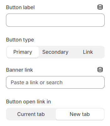
You have the flexibility to modify the label displayed on the button right here.
Additionally, you can determine the button's priority by selecting its type with the Button Type option.
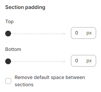
Section padding
Section padding allows you to specify the space between this section and the preceding or following sections, or both.
Last updated