

Banner image
Here is an amazing section that will help you design the Banners creatively and professionally. It has never been easier to create a banner.

Steps
In the theme editor (Customize), click Add section
Locate Banner image
Save
Section settings
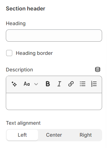
Section header
Use the provided text fields to add a suitable heading/subheading/description. Leave any of them blank if you do not want to display them.
Adjust the text alignment (left/center/right) along with the background color and container type.
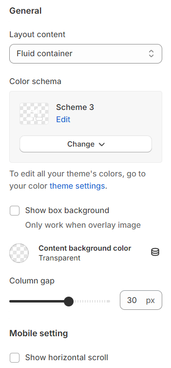
General
Layout: You can choose among Container, Wrapped container, Full width for the banner layout.
Color schema: You are allowed to change text color, background color with preset color.
Show box background: After choosing an image overlay, you can also toggle the background color of the content for enhanced contrast and visibility.
Column gap: Space between two banner items
Mobile setting: Show horizontal scrollbar on mobile screen
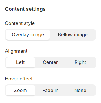
Content
Content style: Choose whether the header appears above or beneath the item image.
Content alignment: Options to align content left, center, or right.
Hover effect: Select from multiple hover effects for images. Note: Hover effects may alter image sizes.
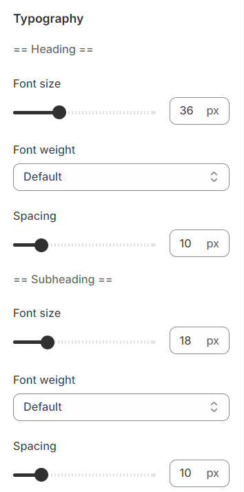
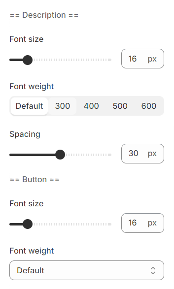
Typography
Typography settings include customization options for headings, subheadings, and descriptions. You can adjust the Font size and Font weight for each of these text elements to match your design preferences.
Additionally, the Spacing between each element can be tailored, allowing for optimal readability and a visually appealing layout that enhances the overall user experience.
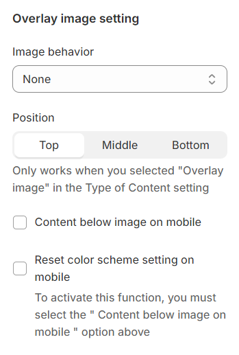
Overlay image
Image behavior: Includes animations that make your images more lively.
After choosing Content style as Overlay image, this Position options will be able to setup.
Section padding
Section padding allows you to specify the space between this section and the preceding or following sections, or both.

Blocks settings
General
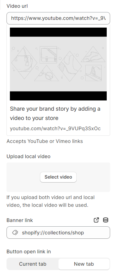
You can customize the media type for each banner image separately and adjust its characteristics based on your preferences.
Width: Specifies the width of each banner when viewed on a desktop.
Type: Identifies the type of media utilized for the banner.

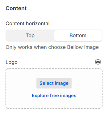
Content
You can personalize the content within the banner image block to your liking.
Content horizontal: When the Content style is set to Below image, you have the option to position the content either at the top or the bottom.
Use the provided text fields to add a suitable heading/subheading/description/button. Leave any of them blank if you do not want to display them.

Last updated