

Lookbook
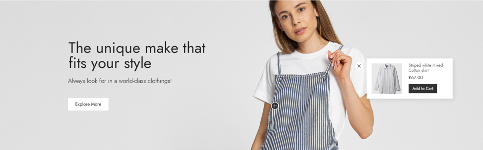
This section allows you to create images packery called Lookbook, you can freely design your lookbook in many ways you like. It's very flexible.
Steps
In the theme editor (Customize), click Add section
Locate Lookbook
Save
Section settings
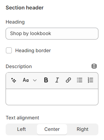
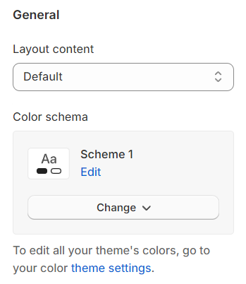
Section header and general
Use the provided text fields to add a suitable heading/subheading/description. Leave any of them blank if you do not want to display them.
Adjust the text alignment (left/center/right) along with the background color and container type.
Layout: You can choose between Fluid Container, Stretch width, Full width for the layout or just leave it with the default layout of the video.
Color schema: You are allowed to change text color, background color, etc. with preset color.
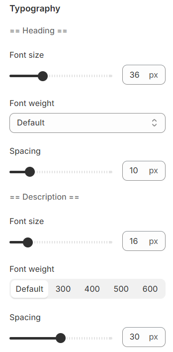
Typography
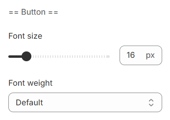
Typography settings include customization options for headings, subheadings, and descriptions. You can adjust the Font size and Font weight for each of these text elements to match your design preferences.
Additionally, the Spacing between each element can be tailored, allowing for optimal readability and a visually appealing layout that enhances the overall user experience.
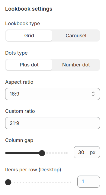
Lookbook settings
Lookbook type: Choose between a grid or carousel format to display your lookbook.
Dots type: Select from plus dot or number dot to mark products within the lookbook images.
Aspect ratio: Offers multiple preset choices along with the option for a custom ratio to fit your specific needs.
Custom ratio: Set an aspect ratio based on your preference.
Column gap: Adjust the spacing between two lookbooks in a row for a clean and organized appearance.
Items per rrow: Determine the number of lookbooks displayed per row to match your layout design.
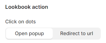
Lookbook action
Click on dots: Configure the action upon clicking dots to either open a popup with more details or redirect to a specific URL for additional information.
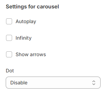
Carousel settings
Autoplay / Infinite Play: Enable this setting for the carousel to automatically scroll through items indefinitely, providing a seamless browsing experience.
Show arrows and Dots: Activate arrows for users to manually swipe through carousel items and dots for a visual indicator of their position within the carousel.
Direct avigation via Dot: Utilize dots to allow users to jump directly to a specific tab or item in the carousel, enhancing navigation efficiency.
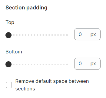
Section padding
Section padding allows you to specify the space between this section and the preceding or following sections, or both.
Blocks settings
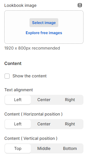
Lookbook image: Choose a thumbnail image that represents each lookbook.
Content: Add descriptive text to each lookbook and customize its alignment, along with its vertical and horizontal positioning, to best suit the layout and design.
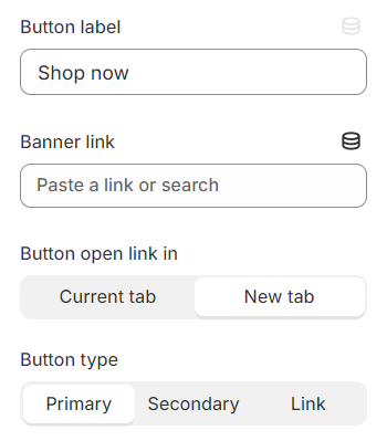
You have the flexibility to modify the label displayed on the button right here.
Additionally, you can determine the button's priority by selecting its type with the Button Type option.
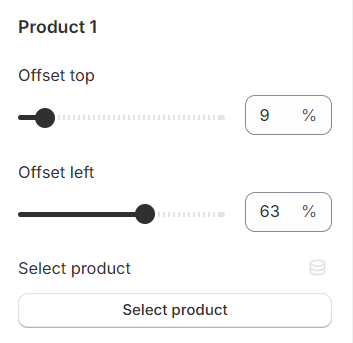
You can include up to 5 products within each lookbook, each marked by a plus sign. The position of these signs can be adjusted to precisely indicate where each product is featured within the lookbook image.
Last updated