

Sub collection

The sub collection automatically displays sublists, enhancing user experience by enabling easy navigation and access to specific data subsets. It streamlines data exploration, making it more efficient and organized for users.
To setup Sub Collection, please follow these steps:
Step 1: Create metafields
To create metafields for Sub Collection, please follow this article.
Step 2: Setup Sub Collection
From your admin, go to Collections and select the collections to setup
Scroll down to Metafields and click to Sub Collections
Click to Select Collections and select the Collections you want to do sub collections
Save this change and you can see the result
Step 3: Add Sub Collection in page Collection
In the theme editor (Customize), open the template selector
Select Collections, then Default Collection.
On the left-sidebar, add section Sub Collection
Make necessary changes > Save.
Section settings
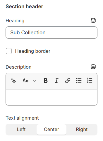
Section header
Use the provided text fields to add a suitable heading/subheading/description. Leave any of them blank if you do not want to display them.
Adjust the text alignment (left/center/right) along with the background color and container type.
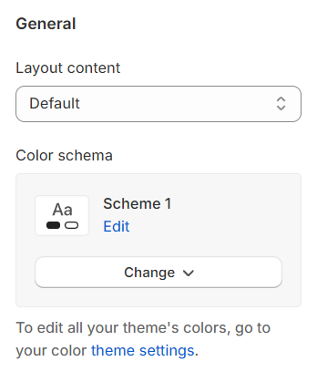
General
Layout: You can choose between Fluid Container, Stretch width, Full width for the layout or just leave it with the default layout of the video.
Color schema: You are allowed to change text color, background color, etc. with preset color.
Column gap: Adjust the spacing between two Instagram items to ensure a visually pleasing and well-organized layout within the Instagram block.
Collection settings
Collection type: Choose between a grid or carousel layout.
Design: Select from three design options.


Hover effect: Options include zoom, border inset, show shadow, or none.
Show product count: Decide whether to display the number of products in each collection.
Hide image collection: Option to not display collection images.
Collection center: Align the collection display to the center.
Custom width images: Set specific widths for images in the collection for a tailored appearance.
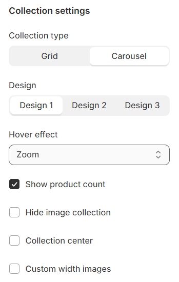
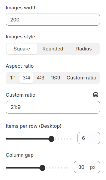
Image style: Choose from square, rounded, or radius for your image edges.
Aspect ratio: Opt for the default value or customize the ratio to fit your design needs.
Items per row (Desktop): Set the number of items you want to display per row on desktop views.
Column gap: Adjust the spacing between columns to create a clean and organized layout.
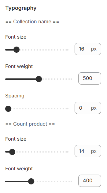
Typography
Typography settings include customization options for headings, subheadings, and descriptions. You can adjust the Font size and Font weight for each of these text elements to match your design preferences.
Additionally, the Spacing between each element can be tailored, allowing for optimal readability and a visually appealing layout that enhances the overall user experience.
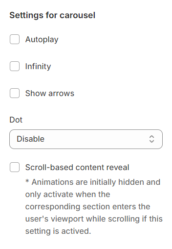
Carousel settings
Autoplay / Infinite Play: Enable this setting for the carousel to automatically scroll through items indefinitely, providing a seamless browsing experience.
Show arrows and Dots: Activate arrows for users to manually swipe through carousel items and dots for a visual indicator of their position within the carousel.
Direct navigation via Dot: Utilize dots to allow users to jump directly to a specific tab or item in the carousel, enhancing navigation efficiency.
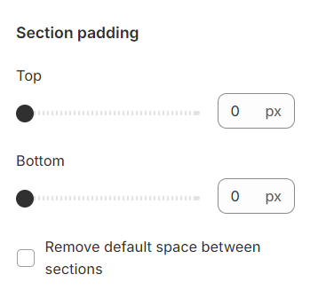
Section padding
Section padding allows you to specify the space between this section and the preceding or following sections, or both.
Last updated