📖
Glozin Shopify
Open Store FreeTheme FeaturesDemoOnline SupportBuy Theme
  • Introduction
  • Theme features
  • Changelog
  • get started
    • Install theme
      • Install Glozin In One-Click Fast Way
      • Install Glozin Manually
    • Update theme
      • Update Glozin In One-Click Fast Way
      • Update Glozin Manually
    • Purchase code & Activation
    • Custom data
      • Create required pages
      • Create required metafields
  • shopify apps
    • Required apps
    • Recommended apps
  • recommended partners
    • Theme Partners
    • App partners
      • Marketing & Conversion
      • Store Management
      • Order & Shipping
      • Store Design
      • Finding Products
      • Selling Products
      • Page
    • Service Partners
  • shopify knowledgebase
    • User guide
    • Edit theme code
  • how to change elements of page?
    • Home pages
      • Home Main
      • Home Chic Boutique
      • Home Footwear
      • Home Modern Wardrobe
      • Home Cosmetic
      • Home Minimal Furniture
      • Home Elegant Style
      • Home Paw Paradise
      • Home Sock
      • Home Activewear
      • Home Healthy Haven
      • Home Morden Furniture
      • Home Underwear
      • Home Echelon Watches
      • Home EchoZone
      • Home Single Product
    • Collection page
      • Horizontal filter layout
      • Vertical filter layout
        • Left filter
        • Right filter
      • Drawer filter layout
      • Pagination style
        • Load more button
        • Page number
        • Infinite scroll
      • List view
    • Collection list page
      • Default design
      • Modern design
    • Product page
      • Thumbnail left
      • Thumbnail bottom
      • Hidden thumbnail
      • Grid 1 column
      • Grid 2 column
      • Stack layout
    • Blog page
      • Left sidebar
      • Right sidebar
      • Grid layout
      • List layout
    • Other pages
      • Search page
        • Horizontal filter layout
        • Vertical filter layout
          • Left filter
          • Right filter
        • Drawer filter layout
      • 404 page
      • Password page
  • theme settings
    • Purchase code
    • Logo and favicon
    • Layout settings
    • Section
    • Typography
    • Color
    • Browser tab notifications
    • Badges
    • Product cards
    • Color swatches
    • Search behavior
    • Wishlist
    • Cart
    • Social media
    • Preload page
    • Animation
    • Store information
    • Currency format
    • Cookies
    • Terms & Condition
    • Custom CSS
  • header group
    • Announcement bar
    • Top Bar
    • Header
      • Mega menu with banner image
      • Mega menu with product
      • Mega menu with collection
    • Custom HTML
    • Custom Liquid
  • footer group
    • Footer
      • Store information
      • Menu
      • Newsletter
      • Custom Liquid
  • fixed group
    • Fake order
    • Mobile navigation bar
    • Quickview
    • Custom colors
  • overlay group
    • Age verifier popup
    • Newsletter popup
    • Before you leave
    • Promotion popup
  • Theme sections
    • Blog posts
    • Brand logo
    • Collection list
    • Outfit Ideas
    • Collection packery
    • Collection tab
    • Counter
    • Custom HTML
    • Custom Liquid
    • Divider
    • Featured product
    • Faq
    • Icon box
    • Image comparison slider
    • Image with text overlay
    • Instagram
    • Instagram shop
    • Lookbook image
    • Lookbook product
    • Multi content
    • Newsletter
    • Slideshow
    • Products deal
    • Products carousel
    • Products grid
    • Products list
    • Products recently viewed
    • Product testimonials
    • Rich text
    • Scrolling text
    • Shopable video
    • Video with text overlay
    • Tiktok video
    • Testimonials
    • Testimonials single
    • Promotion banner
    • Help center
  • collection page
    • Edit collection page
    • Collections list page
      • Page heading
      • Collections list page
    • Collection page
      • Collection banner
      • Sub collection
      • Collection page
      • Filters
  • product page settings
    • Edit product page
    • Breadcrumbs
    • Product information
      • Review and sold
      • Live view
      • Countdown timer
      • Variant picker
      • Product addons
      • Stock countdown
      • Buy buttons
      • Model size
      • Product grouped
      • More colors
      • Text
      • Product custom field
      • Product meta
      • Delivery return
      • Collapsible row
      • Complementary products
      • Trust badge
      • Custom Liquid
      • 360° Product
    • Product set
    • Related product
    • Product thumbnails position
      • Thumbnail left
      • Thumbnail bottom
      • Hidden thumbnail
      • Grid 1 column
      • Grid 2 columns
      • Stack layout
      • Open lightbox
      • Inner zoom circle
      • Inner zoom square
      • External zoom
    • Variant image group
    • Setup External/Affiliate product
    • Setup product group
    • Frequently bought together products
  • OTHER PAGES SETTINGS
    • Blogs
      • Blog category
      • Tags
      • Recent post
      • Banner image
    • Blog posts
    • 404 Page
    • Password
    • Our store
    • About
    • Contact
    • Faqs
    • Compare
    • Wishlist
  • FREQUENTLY ASKED QUESTIONS
    • How to translate a theme after adding a new default language?
    • The purchase code is already activated on another site
    • Missing images when install Glozin
    • Some pages are missing
    • Theme translation
    • Change currency
    • The desktop screen look more like on a tablet
    • Missing template "layout/theme.liquid"
    • Change free shipping message
    • How to setup pre-order products?
    • How to translate "Buy now" button?
    • How to add a staff account
    • How to change fonts?
Powered by GitBook
On this page
  • Section settings
  • Blocks settings
  1. header group

Header

PreviousTop BarNextMega menu with banner image

Last updated 10 months ago

We also offer three distinct layout blocks for the header mega menu, each designed to cater to different visual and navigational preferences.

Section settings

Section width: You can choose among Fluid Container, Stretch width, Full width for the layout or just leave it with the default layout.

Color scheme: You are allowed to change text color, background color, etc. with preset color.

Desktop logo on desktop: Select a predefined position for the logo on the desktop site.

Separator line: Decide to show the separator line on which page.

Enable sticky header: Turn on the sticky header feature to keep the header visible at the top of the screen as users scroll down.

Enable sticky header on mobile: Choose whether the sticky header feature should also be active on mobile devices, ensuring easy navigation across all platforms.

Transparent on the homepage: Turn on the option for a transparent header, offering a sleek look to your site.

Enable in mobile: Decide whether to apply the transparent header feature to mobile devices as well, ensuring a consistent design across all platforms.

Mega menu: Select from available mega menu designs or create a new one to enhance site navigation.

Dropdown animation: Choose an animation effect for when the dropdown menus are activated, adding a dynamic visual touch to the user interface.

You can set up text color and background color for your desire labels.

Redirect to link when clicking menu parent item: Decide if clicking on a parent menu item should redirect to a link.

Menu tabs: Decide to show all collections or custom collections list under the categories tab.

Menu mobile title: The color for the title and background can be set here.

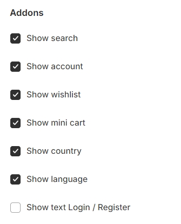
You have the autonomy to select which icons or features are displayed, allowing you to tailor the interface to your preferences and the needs of your users.

Section padding allows you to specify the space between this section and the preceding or following sections, or both.

Blocks settings

Menu item: Specify the name of the menu item to which the layout will be applied.

Select label: You can choose a label to display beside the menu item for additional information.

Submenu:

  • Desktop menu columns: The submenu settings include the option to determine the number of columns for the desktop menu.

  • Mega menu custom width: You can also set a custom width for the mega menu.

  • Center submenu: Align the submenu to the center.

  • Full width: If you select full width, it will override any custom width setting, expanding the menu across the entire screen width.

Mega menu with banner image
Mega menu with product
Mega menu with collection